Parallax Creative
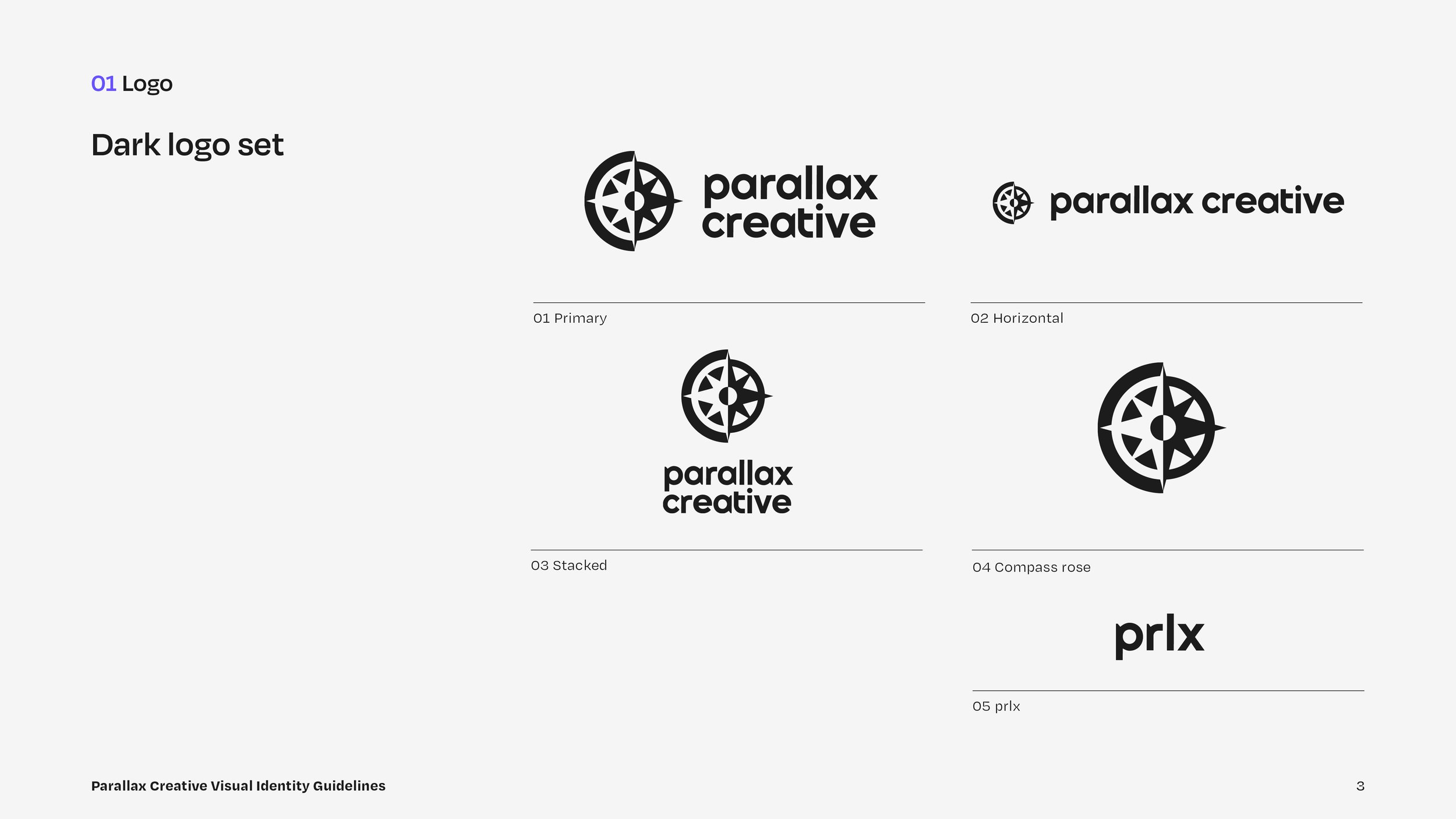
Logo
Style Guide
Business Cards
Website Exploration
Deliverables
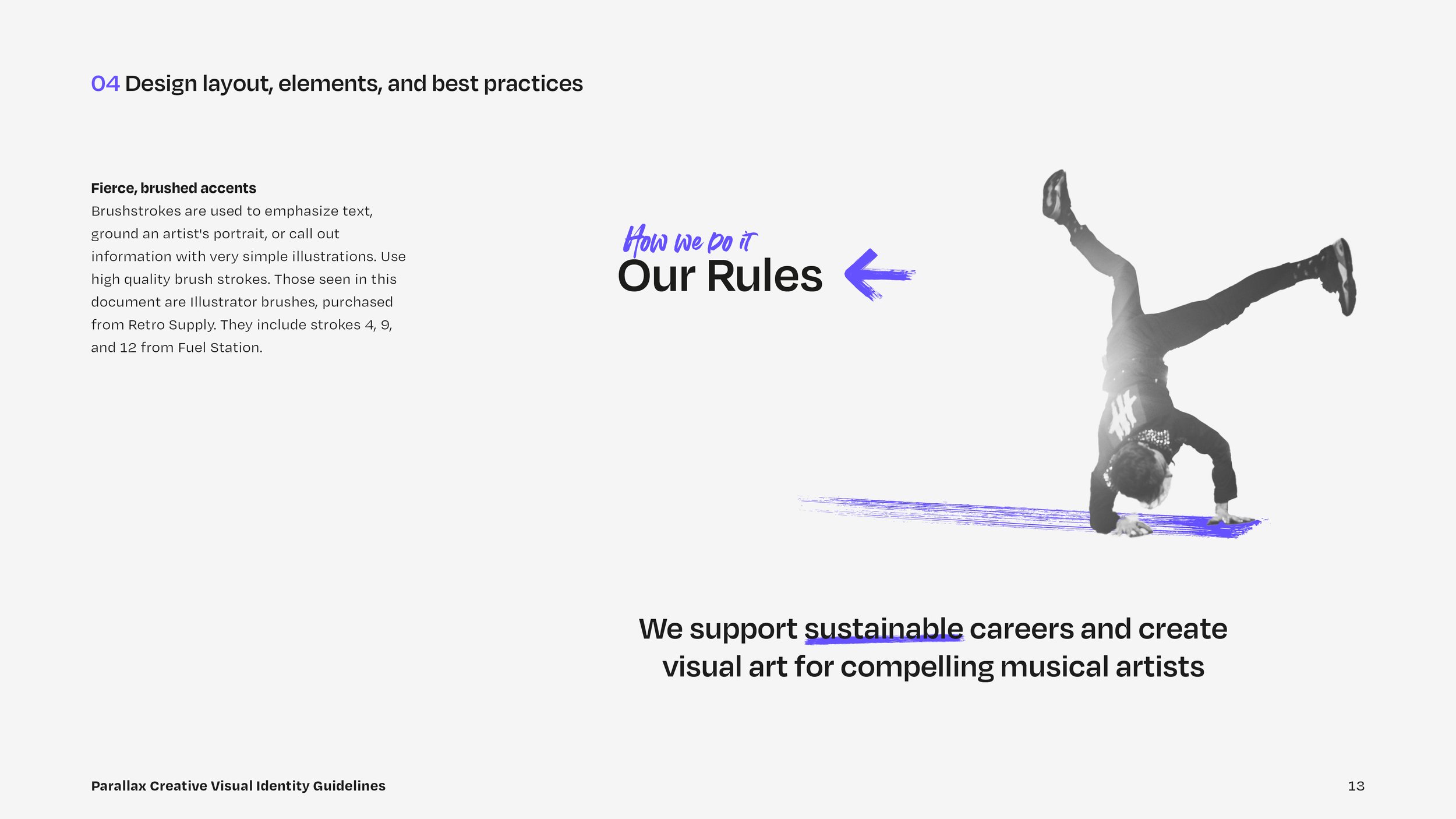
Parallax Creative supports sustainable careers and creates visual art for compelling musical artists through management and media production. They are fiercely devoted to their clients, offering guidance and direction, balanced with a pragmatic point of view.
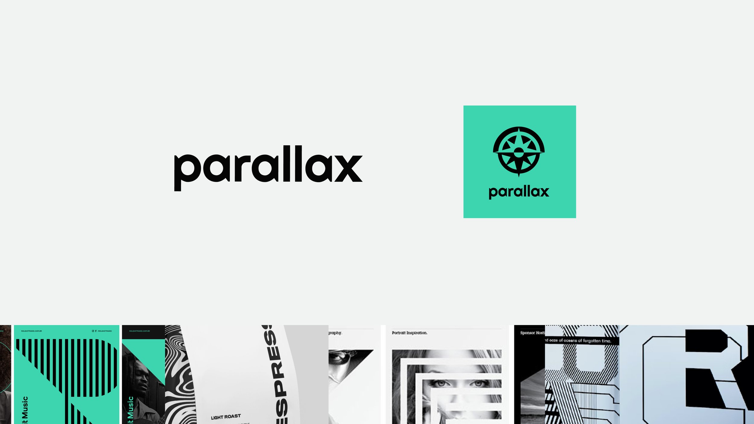
Originally created in the mid-2010s, the former compass rose mark and type treatment belonged to an aesthetic that was no longer in style. Parallax Creative needed a timeless logo and a visual identity to support its growing brand.

Creative Brief
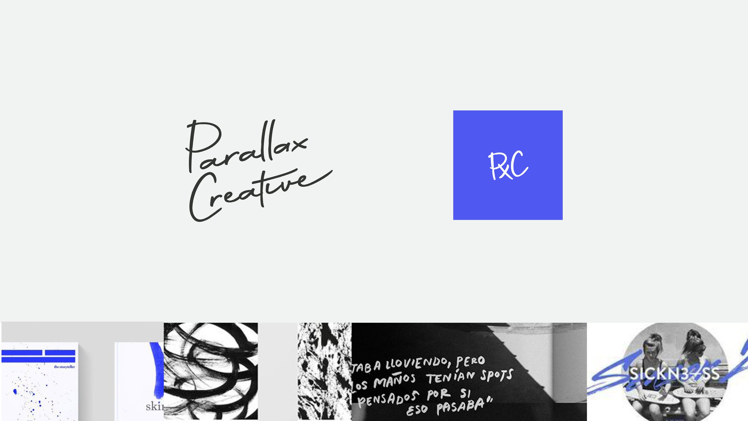
Parallax’s visual identity needs to speak to both artists and other businesses. Initial directions explored the concepts of fierce, edgy, modern, and timeless.
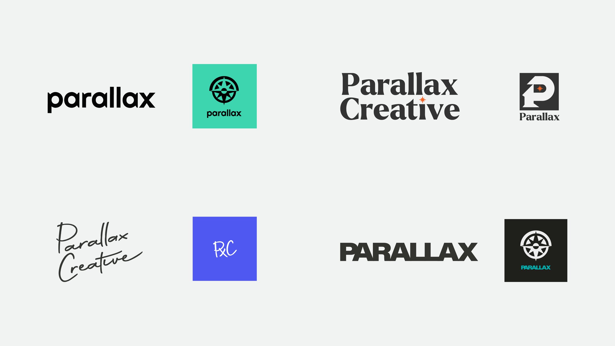
Chosen Direction
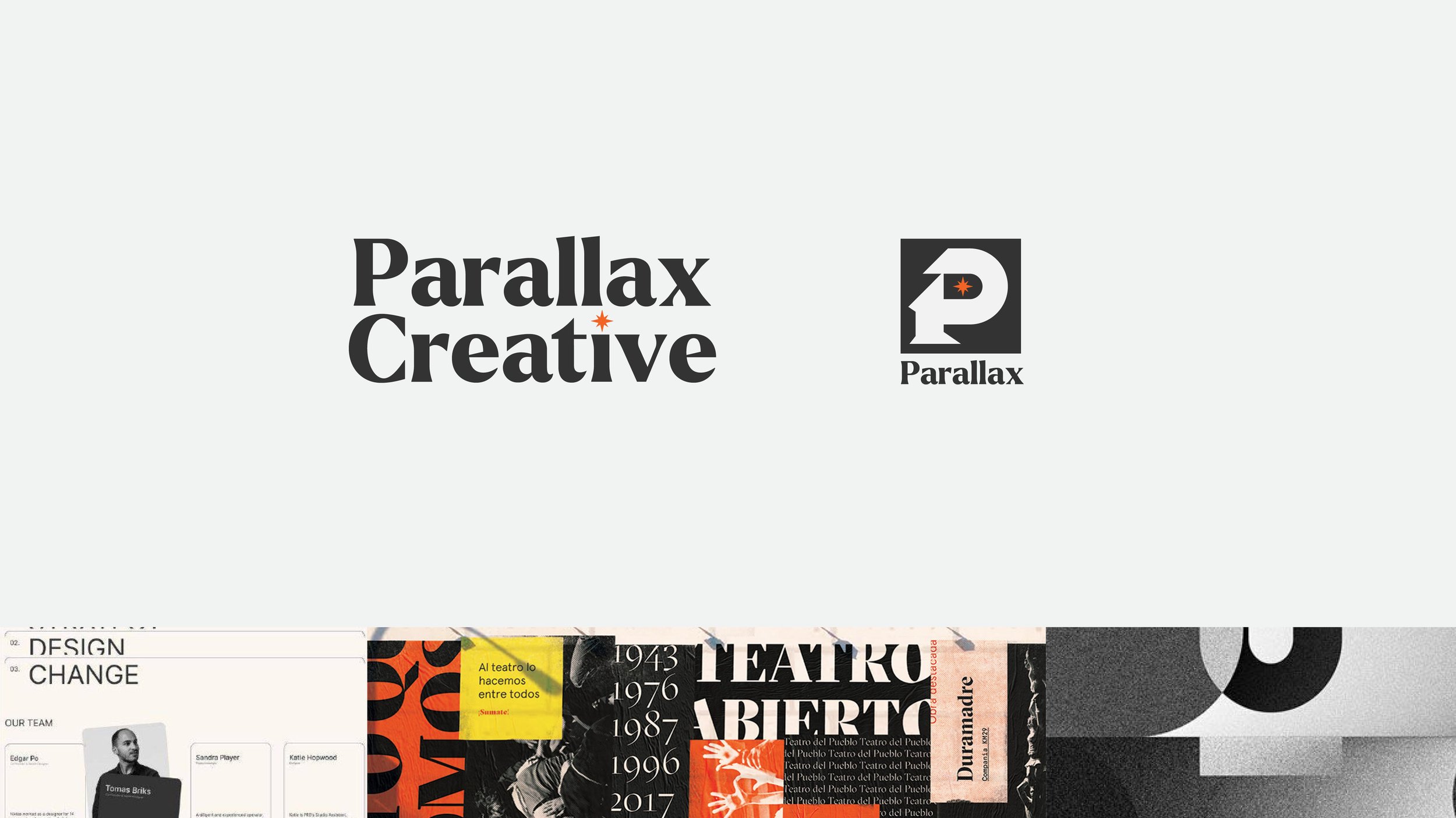
Though we explored several directions, the final logo design was ultimately a refresh of its original. The modernized compass rose and typemark are clean, strong, and will successfully reproduce across the many mediums of the music industry.
A high contrast aesthetic, vibrant purple, and handwritten secondary typeface inject energy and fierceness into the brand. The mood is further enhanced by images sourced from Parallax Creative’s own photography portfolio.